
Dashboard & Data Visualization
A Cross-Industry Analytical Dashboards & Data Visualization
A case study spanning Microsoft, Integrated Marketing Group, 7-Eleven, GE Renewable Energy, and Valimail — on turning dense, fast-moving, and predictive data into interfaces people can act on.
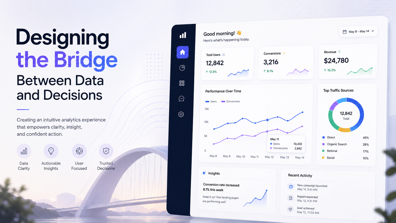
01 The Problem, Everywhere I’ve Worked
Five companies, five different products. A real-time marketing platform. A 71,000-store retail operation. A renewable energy field-service business. An email-security SaaS tool. An enterprise cloud marketplace. Underneath, I kept running into the same problem: the data people needed already existed it just wasn’t in front of them in a form they could use.
📊 The Data Exists
A campaign manager had predictive engagement models. A field leader had audit, incident, and asset data across 71,000+ stores. An IT admin had a whole marketplace to deploy. The data was real, rich, and comprehensive.
🔍 No Decision Surface
But none of it lived in a form anyone could act on in the next five minutes. People exported to Excel. They clicked through disconnected systems. They couldn’t compare options fast enough to decide.
The real gap was never that the data didn’t exist.
It was that no one had designed the surface that let a person act on it.
02 Research
Listening before designing
Every project started the same way: with research, not assumption. Usability testing with 50+ users. Formal benchmark studies. Structured interviews. Journey mapping. And critically — a plan to re-measure after launch, not just before.
User Testing
50+ users watched exactly where they got stuck, gave up, or exported to Excel.
Formal UX benchmarks & telemetry showed where the current design was failing.
12+ structured interviews revealed different mental models across audiences.
Journey Mapping
Understanding workflows showed why one dashboard couldn’t fit all needs.
03 The Insight
It’s an information-density problem, not a chart problem
How much comparable, trustworthy information can one card carry before a person can no longer scan it fast enough to decide?
On the cloud marketplace, this reframed discovery around the card system and filters so people could compare without clicking into each option.
On the marketing dashboard, it revealed a harder problem: how do you represent a forecast not a fact so someone trusts it enough to act, without confusing it for certainty?
A forecast is not a fact. Most of the design work wasn’t the chart itself — it was the surrounding visual language of confidence.
04 System
Building systems, not screens
None of this scales as one-off screens. I built reusable chart, table, and data-visualization primitives in Figma — not to decorate projects, but to make teams faster, more consistent, and able to compose without reinventing.
Components shipped
Design-to-dev time
Consistency
The real gap was never that the data didn’t exist.
It was that no one had designed the surface that let a person act on it.
05 The Work
Five examples, in practice
Microsoft — Care Management, Microsoft Cloud for Healthcare
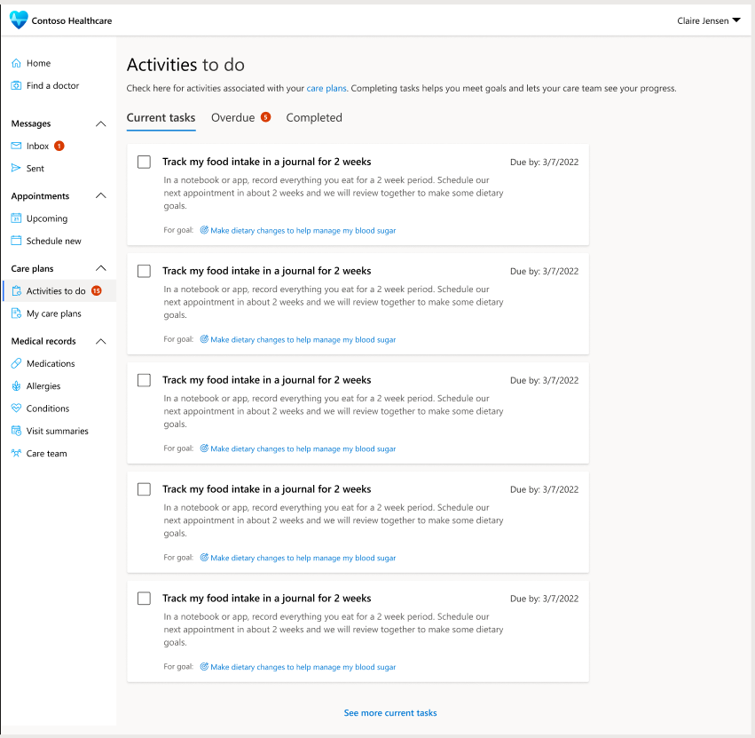
Care teams managing large patient caseloads had no consolidated view of where care plans stood. I contributed to the design of the Care Plan Activities Dashboard — a provider-facing analytics surface combining a caseload status breakdown, an aged-overdue-activity view, an active/upcoming view, and a connected, filterable record table — alongside the patient-facing portal used for scheduling, messaging, and care plan tracking. Every flow touched protected health information, so data-flow decisions were made jointly with engineering, security, and legal.
Key Design Decisions
✓ 360° patient health view with integrated clinical timeline
✓ Real-time activity tracking with status indicators and alerts
✓ Microsoft Teams integration for seamless virtual care
✓ Care plan template system for accelerated plan creation
✓ Analytics dashboard for population health insights
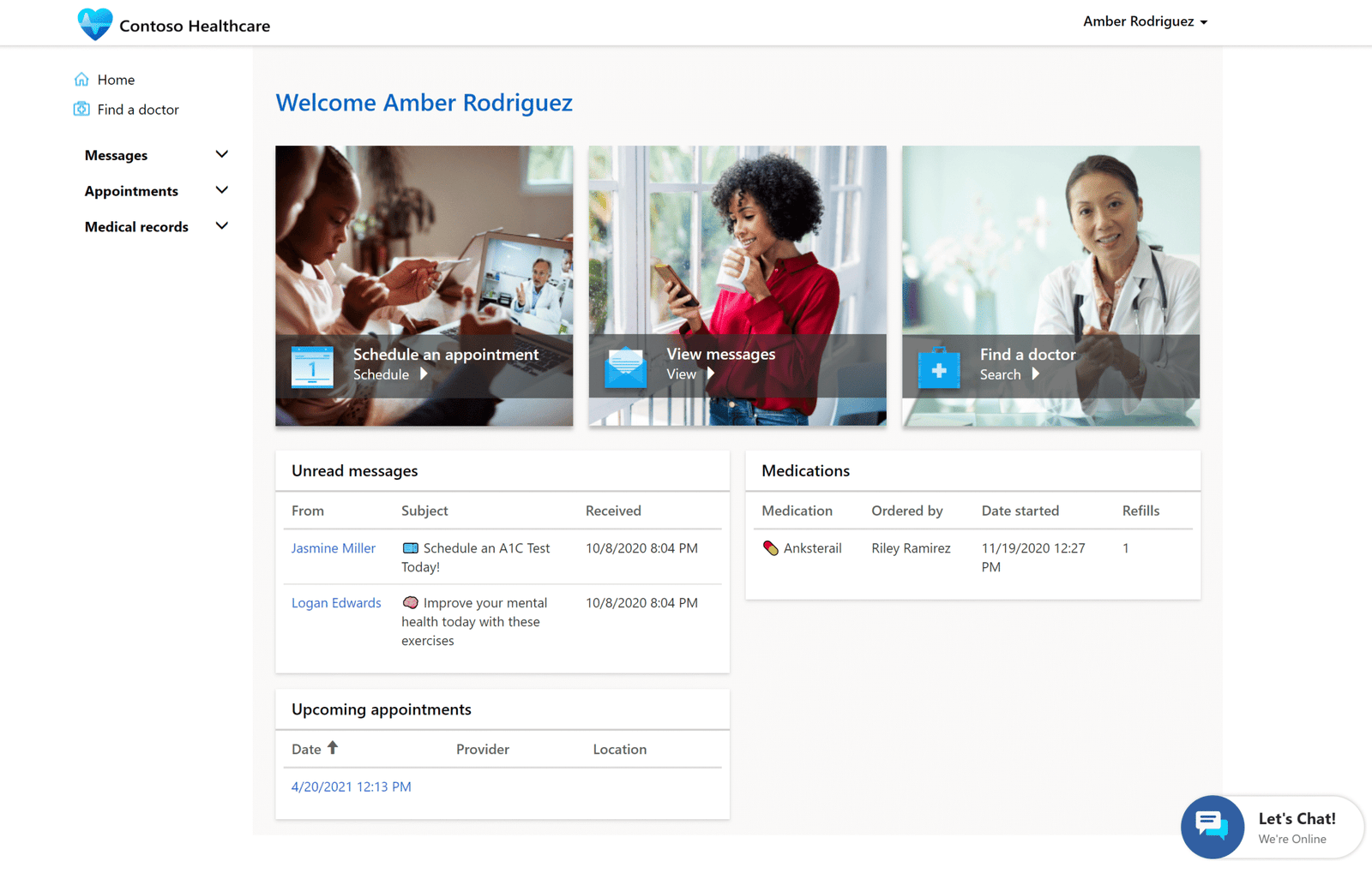
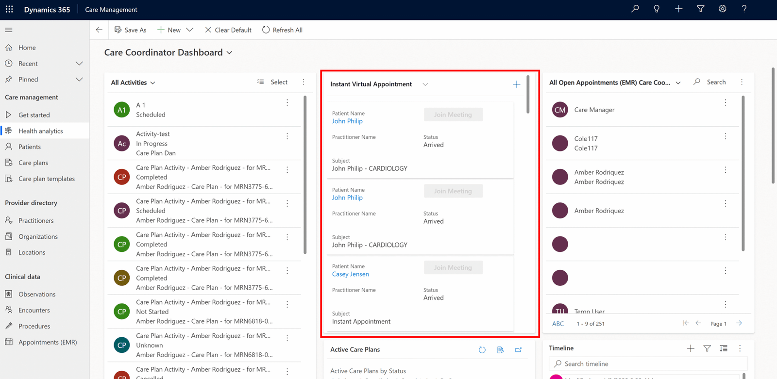
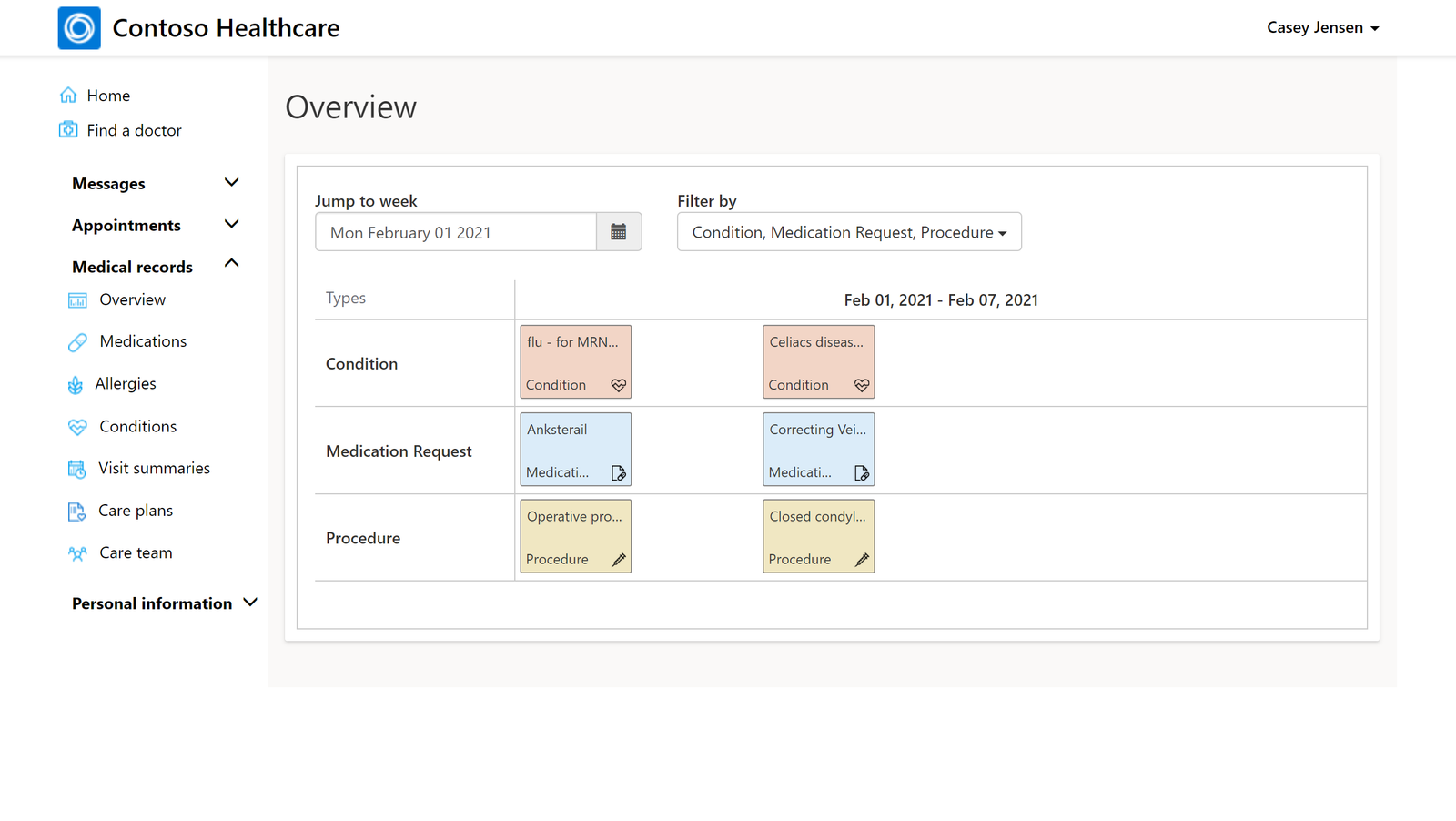
Before
✓ Data scattered across 4-5 systems
✓ 18 minutes to locate patient info
✓ No predictive alerts
✓ SUS Score: 48/100
After
✓ Unified 360° patient view
✓ 2 minutes to critical info
✓ Predictive alerts + team collaboration
✓ SUS Score: 82/100 (+71%)
GE Renewable Energy — Field Operations & Predictive Analytics
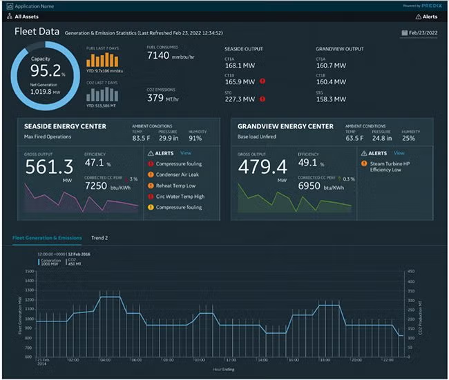
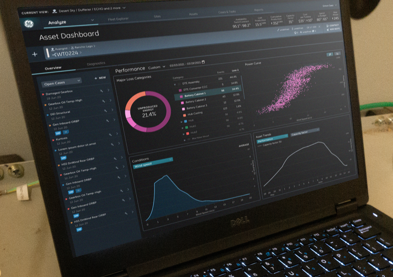
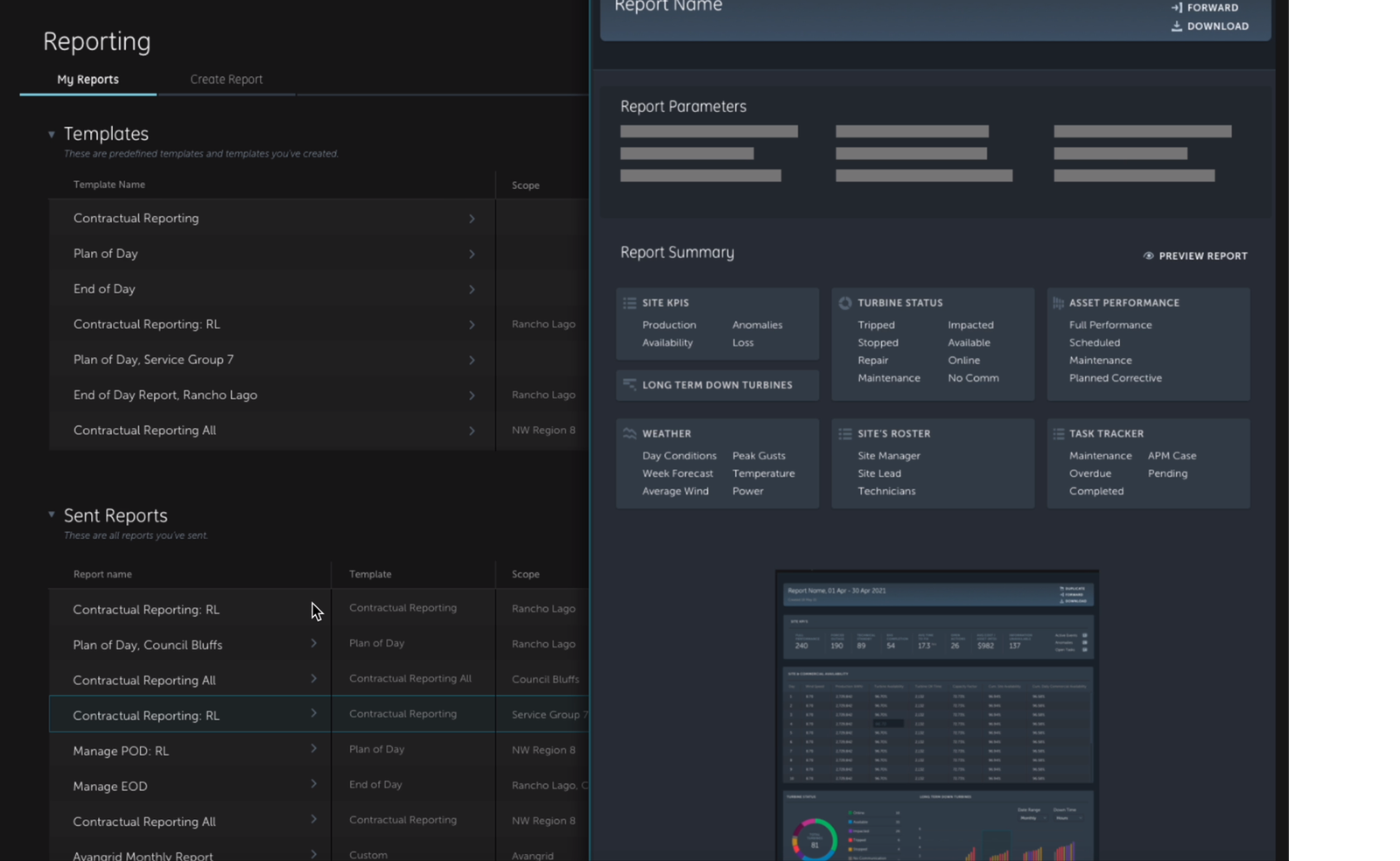
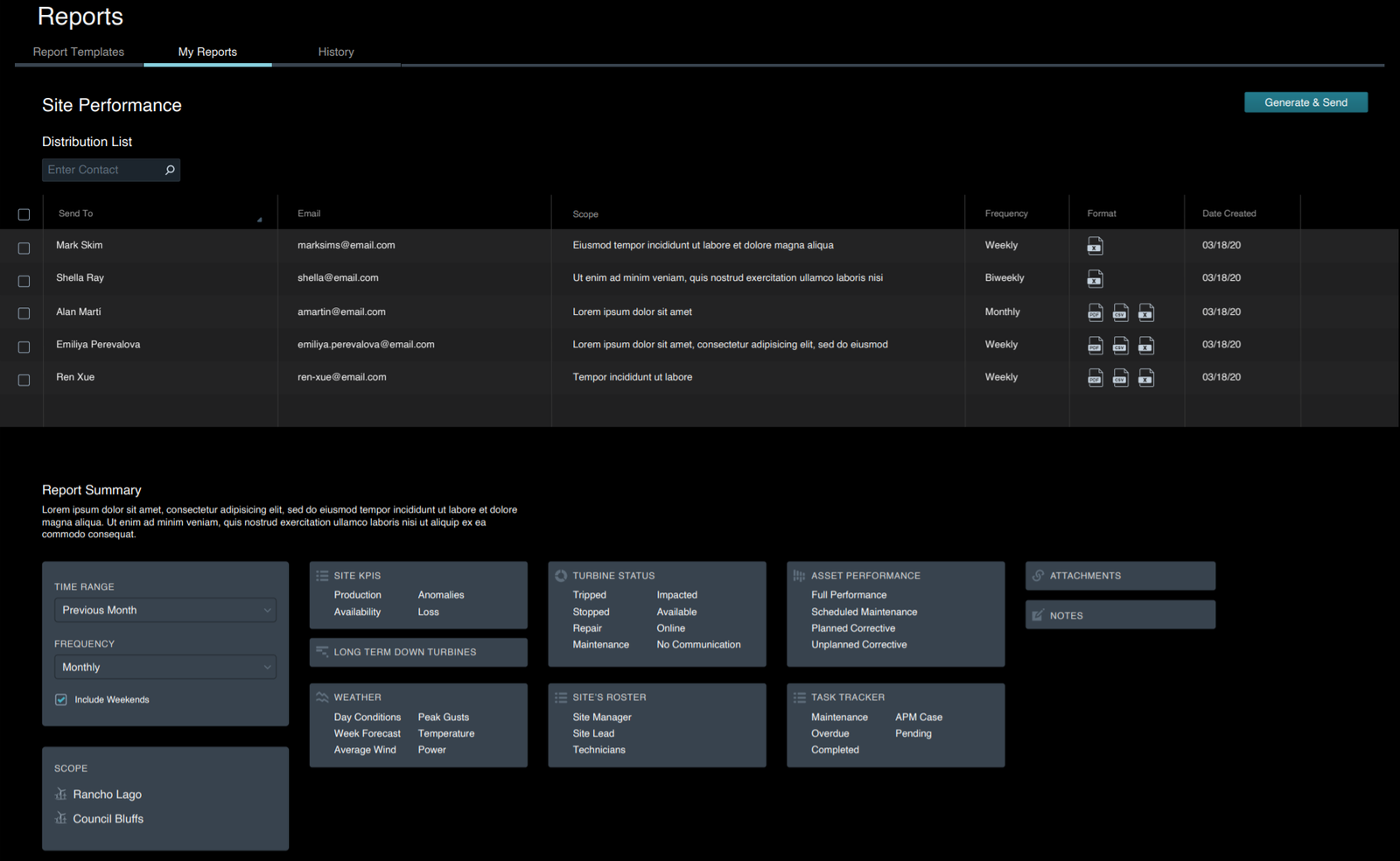
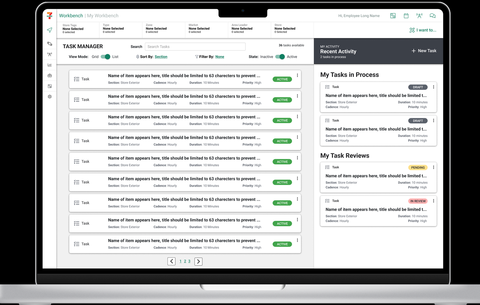
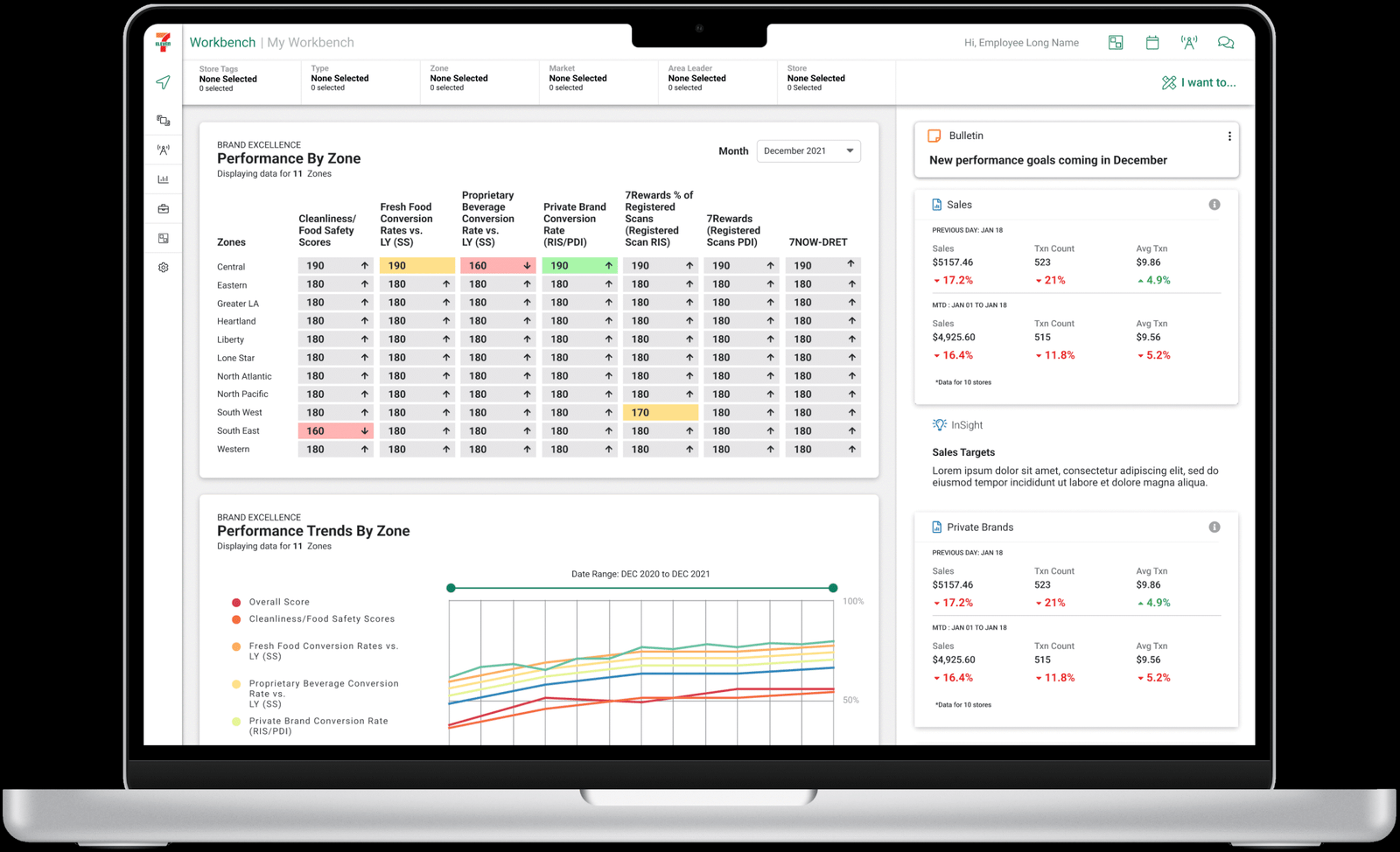
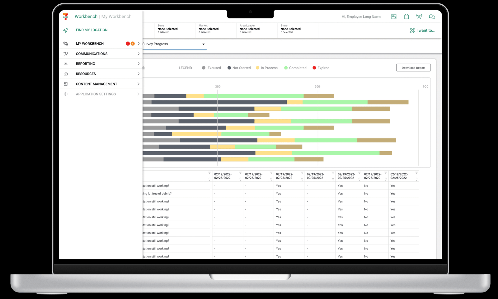
Consolidated task, audit, incident, and asset-verification data into one field-leader view across 71,000+ stores, serving 6M+ daily customers and 45,000+ employees, with reporting optimized separately for desktop, mobile, and point-of-sale. Built a multi-layer dashboard architecture: field technicians access immediate alerts and task lists, regional managers view portfolio analytics and financial impact dashboards, executives see KPI summaries and strategic insights.
Key Achievements
✓ 71,000+ asset real-time monitoring dashboard
✓ Predictive maintenance with 87% failure detection
✓ Advanced report generation module (self-service in 5 min)
✓ 43% incident response time reduction
✓ $12M annual downtime cost savings
https://poonamvora.com/wp-content/uploads/2021/05/record2.mov
Integrated Marketing Group — Real-Time Analytics Dashboard
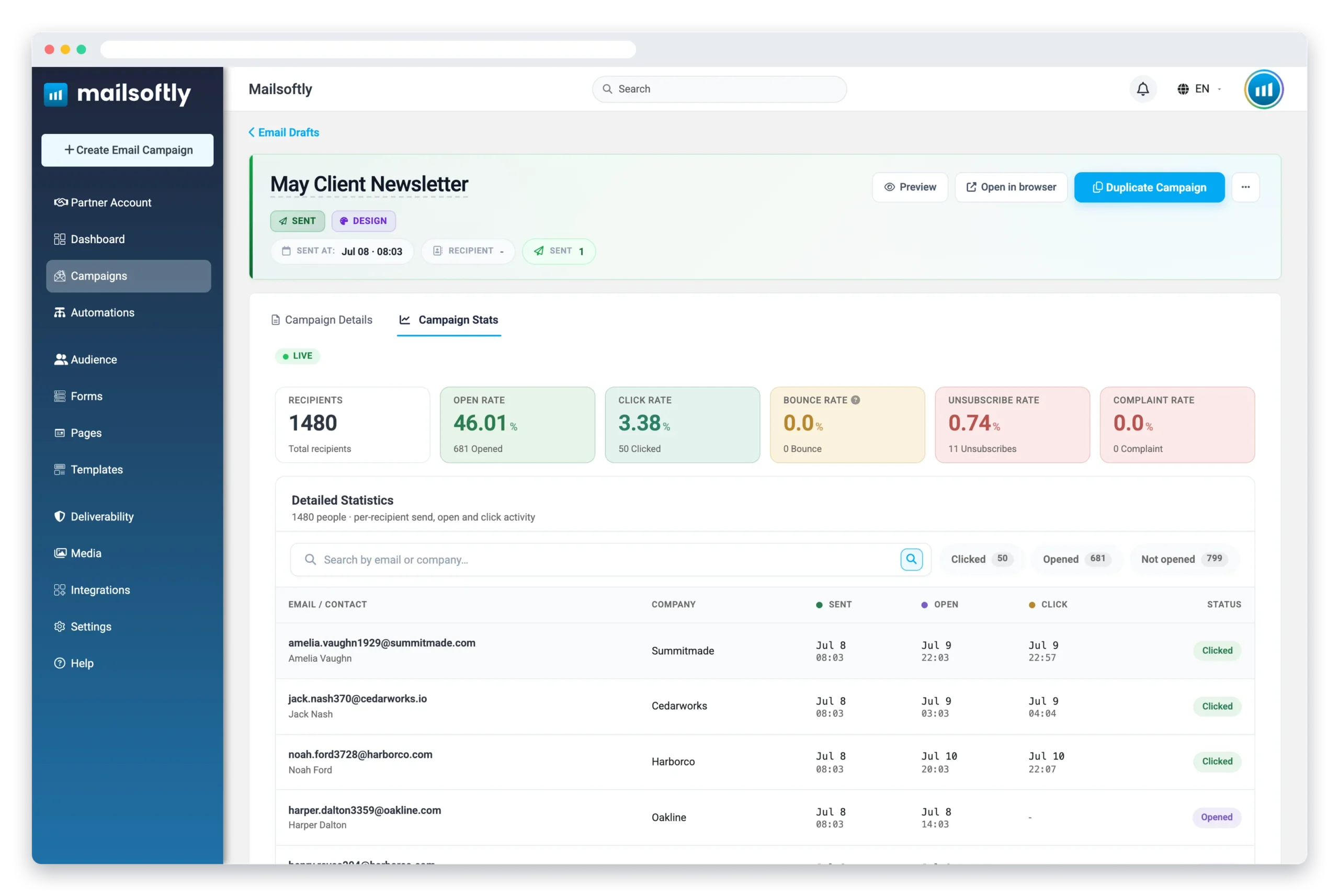
Campaign managers were making budget and creative decisions using reports that were hours old, while the data science team’s predictive models sat unused in notebooks. Led UX for a real-time analytics dashboard that embeds predictive and machine-learning outputs directly into marketer-facing UI, closing the gap between data existing and a person being able to act on it in 5 minutes.
✓ 150+ component design system shipped
✓ −30% design-to-development time
✓ +15% content recommendation engagement
✓ −40% dashboard load time
✓ +18% nighttime usage (dark mode)
7-Eleven — Field Operations Dashboard
Outcomes
✓ 3-persona design (technicians, managers, executives)
✓ Multi-device responsive (desktop, mobile, PoS)
✓ 78% daily adoption rate
✓ 43% faster incident response time
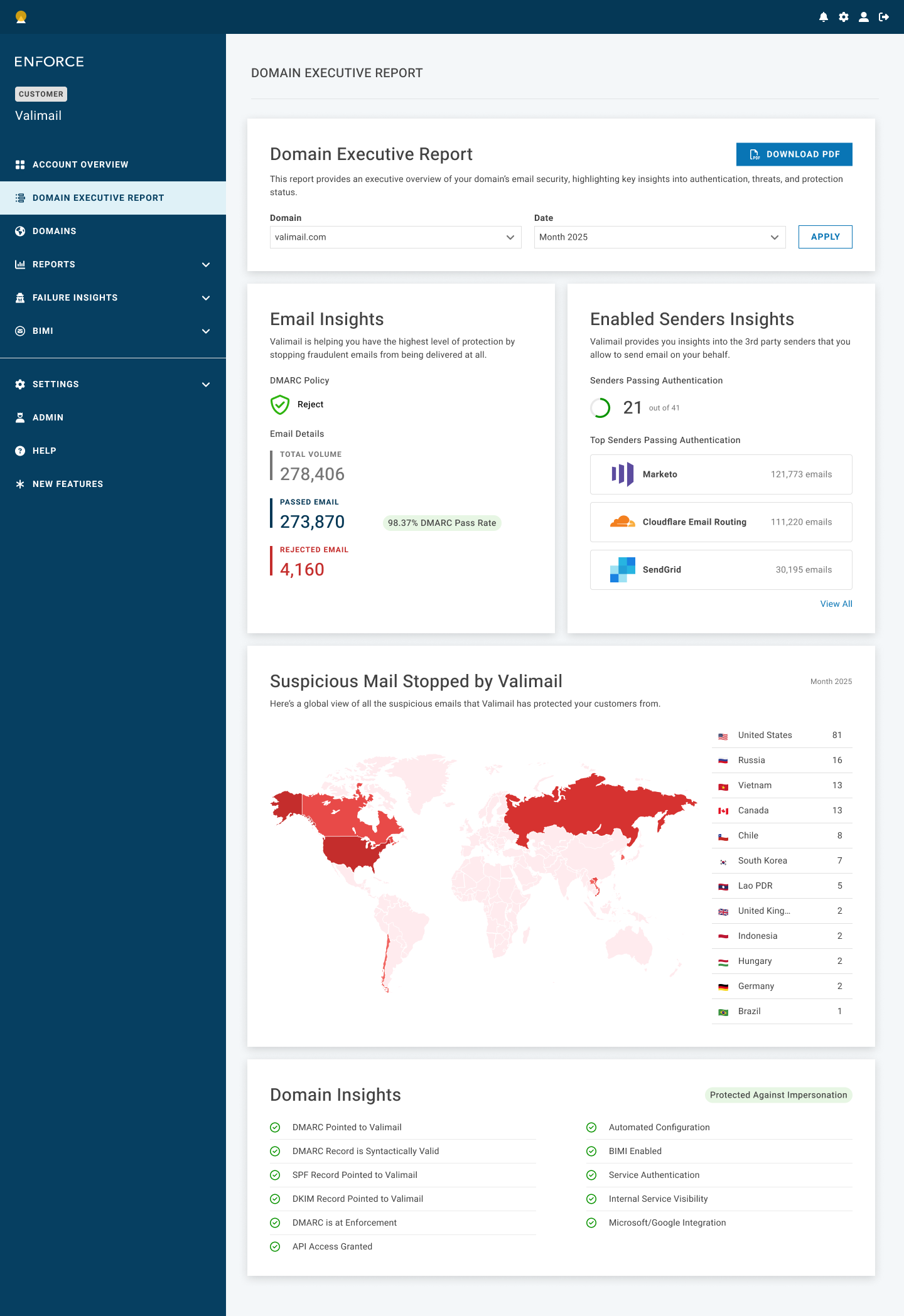
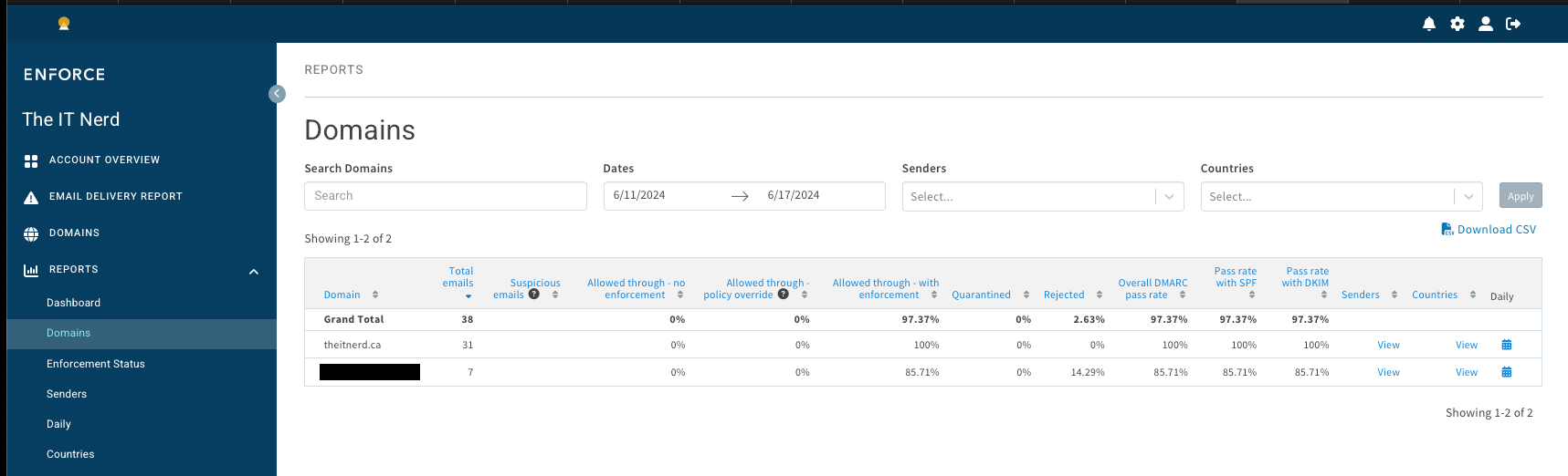
Valimail — Email Security Admin Dashboard
Design System Contributions
✓ Consistent data-visualization patterns across product
✓ WCAG 2.1 AA accessibility audit & compliance
✓ Reusable chart, table, and alert components
✓ Dark mode support for security monitoring
Note: Due to confidentiality requirements, the detailed thinking process and outcomes of this UX case study project are only available in a limited format. Additionally, some aspects of the project have been modified for security reasons and may not reflect the current state of the project. Please feel free to reach out to me at reach.poonamv@gmail.com if you have any questions or would like to discuss further. Thank you for taking the time to review this case study!